If you have trouble viewing this, try the pdf of this post. You can download the code used to produce the figures in this post. Modified May 22, 2012 to clarify Table. Modified Sep. 4, 2013 to fix typos.
Normal probability models for x-ray measurements
In my last post, I described a three part model used in statistical signal processing: (1) an information source produces outputs described by a finite dimensional vector, (2) a probabilistic mapping between the source outputs and the measured data, and (3) a receiver or processor that computes an estimate of the source output or makes a decision about the source based on the data. I showed that in x-ray imaging the information is summarized by the A vector whose components are the line integrals of the coefficients in the expansion of the x-ray attenuation coefficient. The basis set coefficients a(r) depend on the material at points r within the object and the line integrals Aj = ∫ℒaj(r)dr are computed along a line ℒ from the x-ray source to the detector. I then showed the rationale for a linearized model of the probabilistic mapping from A to the logarithm of the detector data L
(1) δLwith_noise = MδA + w
In this post, I will try to convince you that the multivariate normal is a good model for the noise w. This will lead me to discuss tests for normality including probability plots and statistical tests based on them such as the Shapiro-Wilk test[1] (available online) for univariate data and Royston’s test[2] for multivariate data.
Normal probability plot
The most widely used test for normality is the normal probability plot. Although it is easy to create them with statistical software, the theory behind them is hard to find. For the mathematical rigor that I like, i.e. low, the theory is quite simple but a google search on the theory rapidly leads us into math thickets like distributions of order statistics. The method is based on two observations. The first is that the (normalized) index of the sorted data gives the cumulative distribution function (CDF) of the dataset. Some thought shows why this is reasonable. For example, if the probability distribution function (PDF) is peaked, then there will be a lot of samples near the peak and a plot of the normalized index versus the sorted values will show a rapid increase near the peak of the PDF. Fig. 1↓ (a) shows an example with normal distributed data. The black dots are samples of a normal random variable and the red line is the theoretical CDF. Notice the close agreement. The code to produce Part (a) of the figure is shown in the box.
%% compare normalized index sorted data to cumulative distribution function npnts = 1000; ave = 10; dev = 5; x = sort(dev*randn(npnts,1) + ave); prob = ((1:npnts) - 0.5)/npnts; h = plot(x,prob,’.k’); hold on, plot(x,normcdf(x,ave,dev),’-r’), hold off
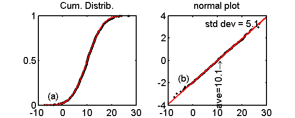
Figure 1 Example of normal probability plot. Part (a) is a comparison of the normalized index of the sorted data to the CDF (see the code in the first box). The black dots are samples of a normal random variable and the red line is the theoretical CDF. In Part (b), the y axis is transformed by the inverse of the normal CDF. Notice that the data now fall close to a straight line.
The only thing tricky about this code is the magic − 0.5 in the computation of the normalized probability. The rationale is based on formulas for the estimates of the means of order statistics usually attributed to a 1958 book by Gunnar Blom[3]. Since the correction is small for my datasets, I did not pursue it further.
prob = ((1:npnts) - 0.5)/npnts;
Based on this observation, we can compare the empirical CDF to the theoretical CDF as in Fig. 1↑. This is difficult because the curve is not linear. So our second observation is that if we distort the y-axis by transforming it by the inverse of the CDF of a distribution, and if that is the actual distribution of the data, the result will be a straight line. Otherwise the transformed normalized index will not be on a straight line. We can easily see this with normal random variables. If Φ is the CDF of a normal random variable with mean 0 and variance 1, then Φ((x − ave)/(σ)) is the CDF with mean ave and variance σ2. If our data are normally distributed, then the distorted normalized index versus the sorted data will be a straight line
(2) y = Φ − 1(prob) = (x − ave)/(σ).
This is done in the code to produce the Part (b) of Fig. 1↑, which is shown below. Eq. 2↑ shows that the slope of the line is 1 ⁄ σ and it passes through zero at x = ave. I fit a straight line to the random data. I computed these two quantities from the line zero-crossing and slope and the results are shown in the Figure. There are random errors but they are close to the actual values. In the code, recall my fondness for using complex quantities to represent 2D vectors. The Matlab plot function handles complex numbers appropriately and my BestFitLine function expects a complex vector as input.
z = x(:) + 1i*norminv(prob(:));
h = plot(z,’.k’);
    % fit line to data and use it to compute the ave and get slope
L = BestFitLine(z);
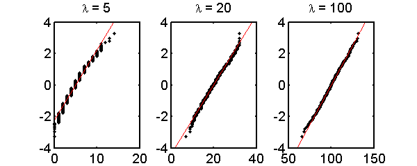
Fig. 2↓ shows normal probability plot for Poisson data with mean values 5, 20, and 100. As expected, there are larger deviations from a straight line for smaller mean values.
Statistical tests for univariate normality
The Shapiro-Wilk[4] test is probably the most widely used to test for univariate normality. The test quantifies the deviation from a straight line normal probability plot criterion. it uses the second observation above that the slope of the best fit line can be used to compute the variance. From these, Shapiro and Wilk defined a W statistic equal to the ratio of variance from the slope of the line to the usual sample variance (times n − 1), S2 = ∑(xk − )2.
(3) W = (σ2̂normal plot)/(S2)
They then showed that the W statistic has some useful properties. For normally distributed data the statistic is
1. scale and origin invariant
2. depends only on sample size
3. is independent of S2 and
4. Less than or equal to 1
From these, they derived some properties of the distribution of W and defined a statistical hypothesis test. The original test was limited to samples less than 20 but Royston[5] extended the test for up to 2000 samples. His algorithm is used in the function ShapiroWilkNormalityTest that I used in the calculations.
Tests for multivariate normality
With the “curse of dimensionality”, tests for multivariate data are more difficult than univariate tests. In my calculations, I used the Matlab function roystest[6], which is based on a test developed by Royston[7]. The test computes the Shapiro-Wilk W statistic for each variable and then combines them to derive a statistic to test the multivariate distribution.
The roystest algorithm is also only applicable for samples up to about 2000. With larger samples, basically all deviations from a straight line are statistically significant and almost all datasets are categorized as not normal.
Normality tests versus mean number of photons
I used these statistical tests to study the conditions for using a normal approximation with idealized data from x-ray detectors. The data were calculated assuming random Poisson distributed total number of photons each with a random energy distributed as from an 80 kVp x-ray tube. I tested five different types of detectors:
- a photon counter N
- a total photon energy integrating detector Q
- the logarithm of the photon counts log(N)
- the logarithm of the total energy log(Q)
- The logarithm of multivariate data that simultaneously measures the integrated energy Q and 2-bin PHA, log(N2Q).
Random data were simulated from the 80 kVp x-ray tube spectrum versus the expected number of photons in the spectrum: 5, 20, and 200.
The code to generate the random data is shown below. For each trial, a Poisson distributed random number of photons ns(k) is computed. Then, ns(k) random photon energies distributed as the x-ray tube energy spectrum are generated using the inverse transform method described in this post. From the photon_energies, we can compute the number with energy less than the threshold, which is the first PHA bin count, and those with larger energy, which is the second bin count. The integrated energy Q is the sum of the photon energies. Finally, the code computes other statistics that are used in our calculations.
   % generate the number of photons for each trial
ns = poissrnd(lambda,ntrials,1); %poissrnd is matlab poisson random number generator
if add1
   ns(ns==0) = 1;
end
dat = zeros(ntrials,7); % N,N1,N2,Q, Ebar,Ebars(1:2)
dat(:,1) = ns;
for k=1:ntrials
      % compute random photon energies using inverse transform method
  photon_energies = specuminv(ceil(rand(1,ns(k))*numel(specuminv)));
       % number of counts in each PHA bin
  dat(k,2) = sum(double(photon_energies<threshold));
  dat(k,3) = ns(k) - dat(k,2);
       % the total energy Q
  dat(k,4) = sum(photon_energies);
  ....
The results are shown in Table 1↓. The results use the usual statistical convention that a ’0’ output implies that the null hypothesis H0, i.e. that the data are normally distributed, is true. Therefore a ’1’ indicates that the normal model is not applicable at the significance level of the test, 0.01. A 1 was added to the random cases with zero counts. The software to reproduce Table 1↓ is included with the code for this post.
Parenthetically, I calculated a value of the Shapiro-Wilk W parameter for these simulations and got a slightly different value from the Shapiro-Wilk software, which contains the Royston corrections for larger sample sizes. I did not explore this further but if anyone knows the reason, I would be interested in it.
Conclusion
The results in Table 1↑ imply that a normal model is acceptable for expected counts greater than 200. There are several caveats. First, the results of the normality tests depend on the random data so they are themselves random. You will get different results when you run the code. I chose the parameters so most of the time my conclusions were true but there will be some runs with different conclusions.
The results are based on computer simulations of idealized models. We really need to run the tests on experimental data. Two good studies are Wang et al.[8] and Whiting et al.[9]. Wang et al. showed that, as expected, the data failed the Shapiro-Wilk test for highly attenuating regions with low integrated current (mAs). However, in those cases they stated that the normal was better than alternatives including Poisson:
... a significant quantity of sinogram data from the highly attenuating region at very low mAs level (17 mAs) failed the normality test (i.e., their p-values are less than 0.05). Strictly speaking, their PDFs can not be expressed as a Gaussian normal functional. Therefore, a cost function of the Gaussian functional for noise reduction and image reconstruction at such low mAs levels may not be mathematically adequate, despite it is a better choice compared to others, such as Poisson, Gamma, etc. [10]
These two studies were for conventional systems using energy integrating detectors. Photons counting detectors with PHA have many sources of noise not modeled in my simulation and it would be interesting and useful to have experimental results. These could be tested for normal distributions using the software included with this post.
In the code for this article, I include the functions for the ATLine object. You need to create an object from these functions. This depends on your version of Matlab. In my version (R2007b), I created a ’hidden’ directory ’@ATLine’ on the Matlab path with these functions. Newer versions of matlab have different object models.
--Bob Alvarez
Last edited Sep 04, 2013
© 2011 by Aprend Technology and Robert E. Alvarez
Linking is allowed but reposting or mirroring is expressly forbidden.